Mosaico

Services
Brand & Identity
Client
Mosaico
Location
Puerto Cabello, Venezuela
Year
2026
Credits
Designer: César Paradisi
Role: Brand Identity & Visual System
Client: Mosaico Pizzeria y Gelato
Location: Puerto Cabello, Venezuela
Year: 2026
Info
Mosaico is a pizzeria and gelato spot in Puerto Cabello, Venezuela, and the brief was simple but specific: make it feel like Tuscany and Naples, not like it's trying to be Italian.
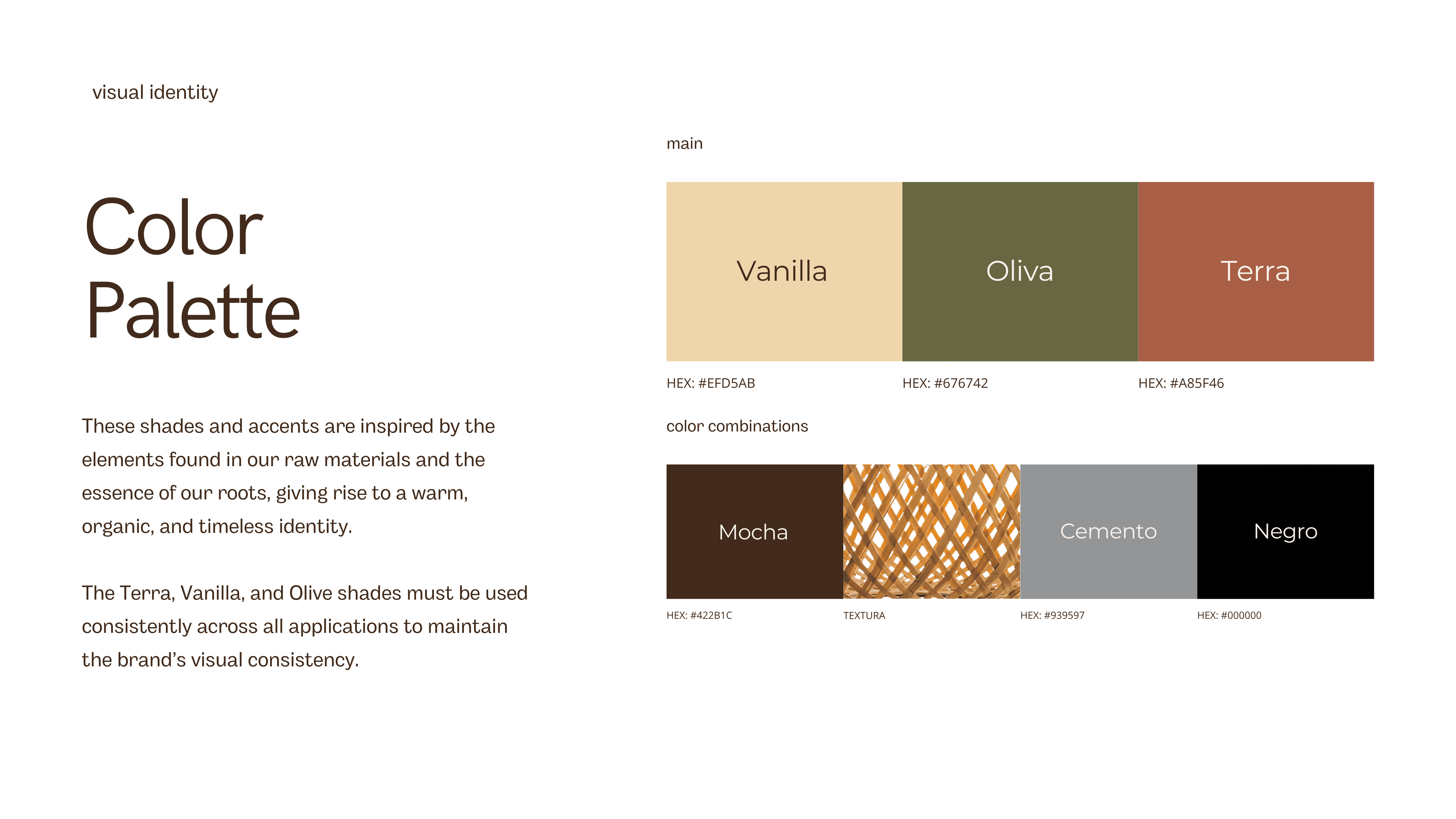
I built the whole system around one shape — an arch. It shows up in the logo, echoes the archways you see in Mediterranean interiors, and gave me something to anchor the isotype around. The palette came from there too: vanilla, olive, and terra as the core, with mocha, cement, and black holding it down underneath. Trajan for headlines gives it some old-world weight, Montserrat keeps everything else clean and easy to read.
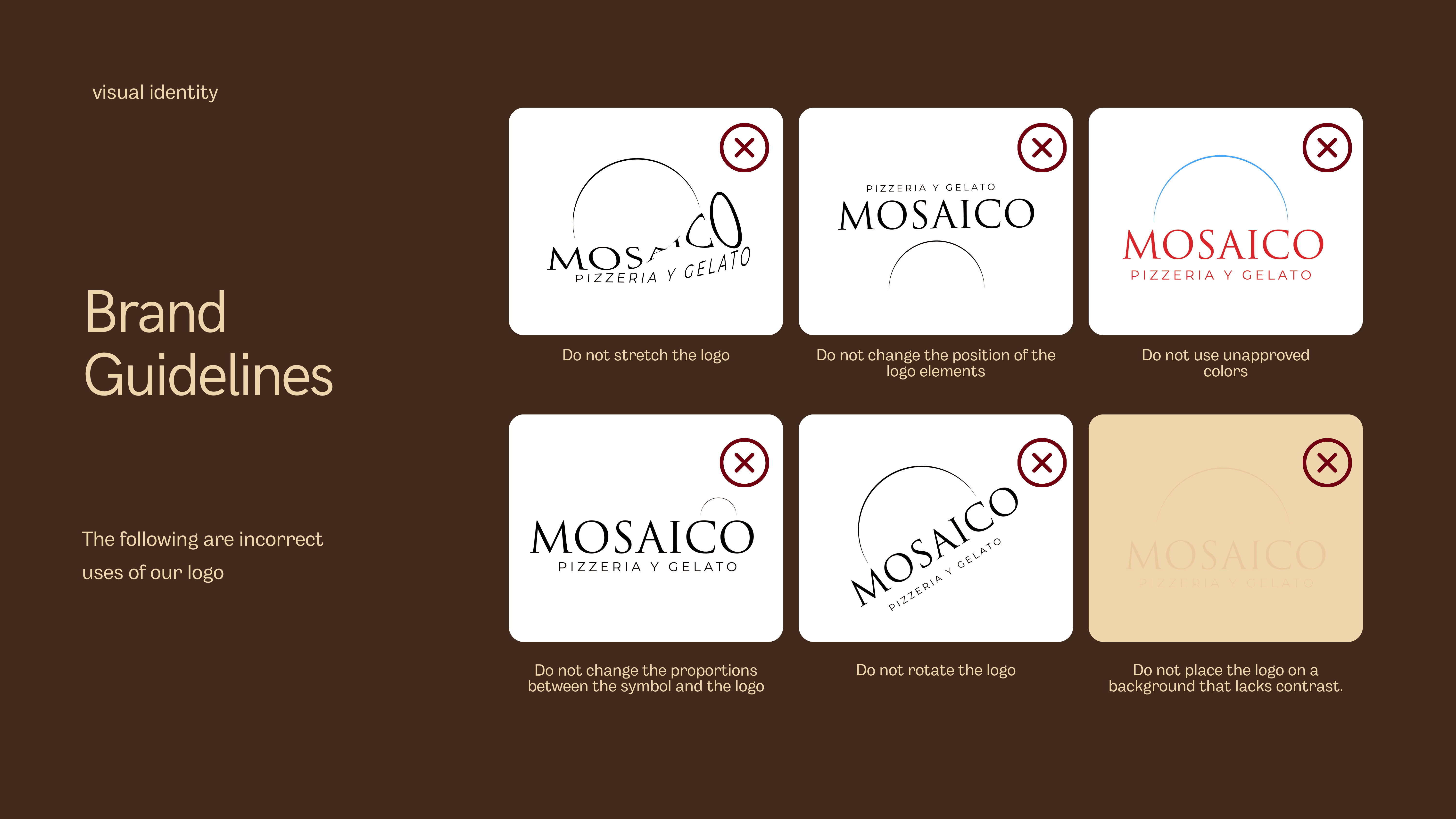
This wasn't just a logo drop — I built out the full system. Color rules, type hierarchy, photography direction (warm, rustic, no harsh studio lighting), even down to which plates the pizza gets served on versus the mains. Every touchpoint, from the apron to the takeout bag, had to feel like it came from the same place.